Sunday, 29 June 2014
Practice A2 Music Video: Wavves by Post Acid
Enjoy watching!
Friday, 27 June 2014
Website Textual Analysis- Lana Del Rey
Within moments of opening Lana Del Rey's website, it becomes clear of the initial aim of it. A large banner cascades down the page highlighting to the audience that there are various different formats in which you can buy her latest single/album such as LP's, CD's and vinyl.
Lana's website showcases her talent, and reflects her retro personality. Lana, being a fan of the 1960's, uses the website to make it clear to the audience what type of singer she really is, soulful and smooth as well as being sophisticated and artistic. One way in which the website does this is through the use of images. Each post included in the website features a different picture of Lana such as close ups and retrospective shots. This connotes that she has full involvement with what is published on the website therefore creating a synthetic relationship with the intended audience. This again displays the type of person Lana wants to come across to the audience as, tasteful and sophisticated.
Furthermore, in a different section of the website, Lana's old, new and upcoming albums are clearly displayed giving the viewer full access to the content. This connotes that she wants her fans to feel more included by giving them a deeper insight as to what music is available.
Lana also provides a deeper insight to her adventures on the road and her general day to day life through the online gallery. This suggests that Lana is 'friends' with the fans in a non personal way.
In addition, further down the website a list of Lana's future venues and tickets for her tour is displayed. Calm, simplistic colours such as blacks and blues are used to maintain the house style of the website as well as reflecting Lana's soulful style of music. The simplistic style allows the viewer to see where they can purchase tickets from as well as keeping up with Lana's busy touring life.
Thursday, 19 June 2014
5 Seconds Of Summer- Music Video Analysis
At the start of the music video, a parody of a disclaimer that is used for movie trailers is used which connotes that the video is going to have a strong yet clear story line to it. It also connotes that the band is playful and is also reflective of their genre 'pop-rock' signifying that they are neither too serious nor to immature. 5SOS's logo is used in the square in the information box towards the bottom of the image to make it clear to the audience who the band featured is.
Following the opening disclaimer, several jump cuts are used to flash back and forth showing a band member, then some text to kick-start the 'story'. The use of jump cuts also helps to distinguish that the music video will follow the 'action' genre and suggests a fast paced video.
- 'Music videos demonstrate genre characteristics':In Don’t Stop, Goodwin’s convention is challenged as 5 Seconds of Summer are a boy band and there is no clear dance routine or stereotypical elements. However, there are some amplifying features that are stereotypically associated with rock bands such as 5SOS playing live on a dark building, wearing dark clothing and a low key lighting to create an authentic pop-rock band look. Also, as the video is based around a movie trailer, it follows the typical expectations of what must be included as we follow the lives of four very different superheroes.
- ‘There is a relationship between lyrics and visuals’:There are some examples of relationships between lyrics and visuals, but more of an illustrative technique has been used not to create meaning, but purely just to show what the word means. For example, the lyrics are “and when you push me off” and in the visual components an old lady is pushing ‘Dr Fluke’ away from her.
- ‘There is a relationship between music and visuals’:The visuals in Don’t Stop contradict the music rather significantly as the song is about falling in love with a girl who doesn't reciprocate the feelings for the boy, yet the music video follows the lives of four superheroes so a contradicting approach is taken here.
- ‘The demands of the record label will include the need for lots of close ups of the artist and the artist may develop motifs which recur across their work’:Goodwin’s theory is supported by 5SOS’s video as there are a large amount of close ups of the artists and a clear, consistent style is maintained throughout the video.
- ‘There is frequently reference to notion of looking and particularly voyeuristic treatment of the female body’:Don’t Stop highly contradicts this convention as there are no voyeuristic treatments of any female bodies and there are no notions of looking through things such as through TV screens.
- ‘There is often intertextual reference’:Goodwin’s convention cannot be applied to Don’t Stop as there are no intertextual references to any website, band, TV show etc. However as 'Don't Stop' is based around a movie trailer, there is an ongoing motif present throughout the video beause the video has an authentic movie trailer feel to it.
History of Music Videos
- It was an elaborate production and involved big amounts of choreography but was on video.
- This was highly popular as it was released during the depression era and it idealised glamour.
- It was also the first time people saw big productions on a cinema screen.
- It was a first time soundtrack that was specifically commissioned for the use of propaganda.

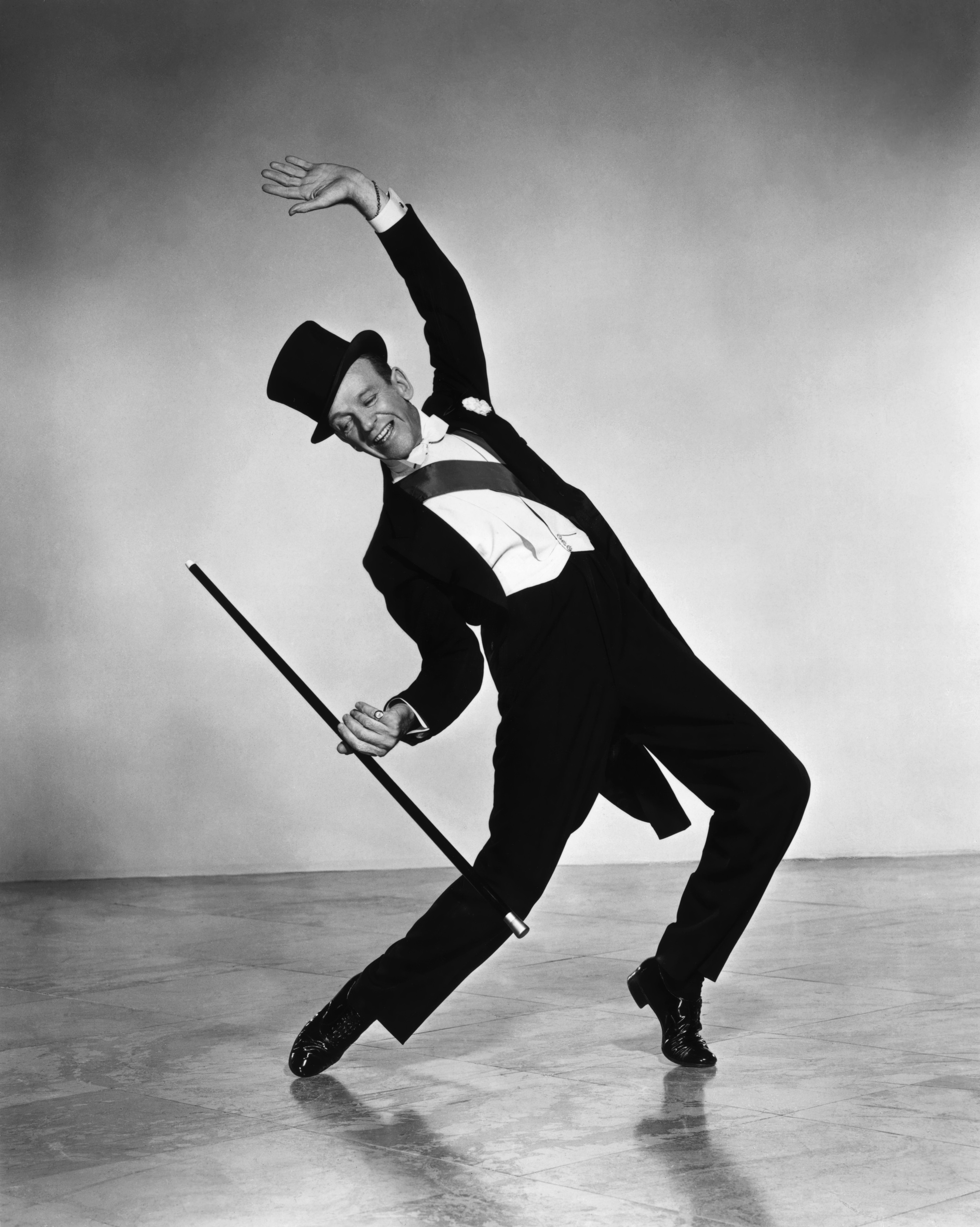
Fred Astaire
- This was where Hollywood began bringing musical and big stars into film.
- He starred in the musical 'Top Hat' in 1935.
Fantasia, Disney 1940
- Walt Disney was trying to get his audience interested in classical music by making a cartoon to go specifically with the music.
- Starred in 'Singin in the rain' in 1952.
- Focused on the dramatic context.

- He made a stage musical based on ‘Romeo and Juliet’.
- Created an explosion of rock and roll, youth culture and the idea of a teen.
- Young people could identify with Presley and felt a sense of belonging to them.
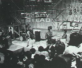
- It was dedicated specifically to music.
- As they were miming it gave the illusion of a live performance.
- Aired every Friday evening.
- Involved a record company making a promo for a band.
- It was made by the BBC.
- It was broadcast weekly on a Thursday night between the 1st January 1964 and 30th july 2006.
- It was originally where people would find out what the weekly no. 1 was.
- Record companies would try and get artists on there.
- If not possible to get an artist (e.g. a band from the USA) you would either have a performance recorded elsewhere or the song played and the camera would pan around people.
- Videos started to be made in order to get your band on as many commercial programmes as possible.
-Good quality production values.
-Total control and cultivation of the artist by the industry.
-From this to Simon Cowell.
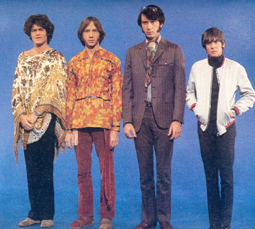
-Was a sit-com series which was made to sell the band.
-Early example of convergence.
-Often portrayed characters (Ziggy Stardust, Jean Genie).

1975-
Video becomes as important as the music as an artistic creation in its own right.
MTV 1981
- First music only TV station with the music guided by VJ’s (Video DJ's).
- Massive impact on pop culture and music industry and contributes to the importance of the music video.
- As more music video channels and the internet impacted upon MTV, their content diversified.
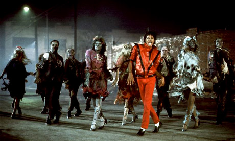
Thriller-Michael Jackson (directed by John Landis)
- 1983, landmark merging of film making and music video.
- Often seen as the most commercially successful music video of all time.
- 14 minutes long.
- Screened after watershed.
- Big experiment with stop motion and animation.
- Gabriel lied under a glass sheet for 16 hours.
- Went to number 1 in the US.
- Was controversial due to religious and sexual iconography.
Monday, 16 June 2014
Beyoncé '4'- album cover analysis
Beyoncé's album '4' is her 4th studio album initially released worldwide on June 24th 2011 by Parkwood Entertainment and Columbia Records. In this fourth album, Beyoncé wanted to diverge away from her usual genre, contemporary popular music and so wanted to create an album in which she could fully express herself therefore recording and releasing songs in the rhythm and blues genre.
The image on the front of the album subverts the generic conventions of what is expected top be on the cover of a rhythm and blues album. Typically, on the cover of a blues album we expect to see some soulful singers and perhaps an instrument of some kind. Whereas on Beyoncé's album '4', she looks mildly sexually provocative in the sense that she seems empowering and fearless. This juxtaposes the genre and overall feel of the album but increases the overall appeal to the vast audience.
The cover for Beyonce’s album is striking and is clearly used to eccentuate her beauty. This is a typical convention of Beyonce's image she has created for herself. The striking image of Beyonce connotes that she is a strong and powerful woman which subverts the dominant ideologies that women are weak and vulnerable. Beyonce's edgy look and consistent sex appeal signifies that she appeals to both men and women. This is not just due to her amazing musical talents, but to her sex appeal. However, both of the images on the front and back of the album are rather fetishistic as several body parts are exposed and large proportion of her body is left uncovered.
The overall style of the album is simplistic, it uses basic images of the artist which creates an overall artistic feel. The background of the album is a pale pastel colour which connotes that Beyonce is pure and angelic which contradicts the image of her placed in front of the background. This is because she looks edgy and fairly raunchy. However, as the colours of her outfit stand out (deep purples and blues), it creates a feeling that she is in a way 'pulsating' off of the album as the two sections of the cover clash. This can be seen as a reflection of what type of music Beyonce creates, strong and beautiful.
Beyonce's album follows the typical conventions of what is expected to be on the cover of an album. For example, it has a barcode and has a spine. The spine contains the name of the album and the artists name. The back panel of the cover also includes the track names, how many tracks there are, the running order of the tracks, a large striking image, bold vibrant colours and Beyonce's logo.
The font style on both the front and back of the album is bold and striking, yet has an essence of beauty and a feminine appeal to it. The use of serifs reflects the genre of music the album is based around, soulful and meaningful. The overall typography of the album is the text is written in block capitals which diverges the listener away from focusing on Beyonce's sex appeal, and reinstates Beyonce's reputation as a strong and powerful woman.


